Searchandising (System 3)
The full search results page -- the page visitors see after they submit a search.
This page explains the full search results page — the page visitors see after they submit a search.
What Is Searchandising?
Section titled “What Is Searchandising?”Searchandising is the search results page. It is the page visitors land on after they type a query and press Enter (or click “See All” in the Searchbox popup).
This is where the heavy lifting happens. The results page shows:
- A grid of products matching the search query.
- Filters so the visitor can narrow down results (by category, brand, price, color, etc.).
- Sorting options so the visitor can reorder results (cheapest first, newest first, etc.).
- Pagination so the visitor can browse through many pages of results.
- Banners for promotions or announcements.
- A result count showing how many products were found.
When Does It Appear?
Section titled “When Does It Appear?”The results page only shows up on a specific URL. For example, if you set the page to /search, the SDK will only display the results page when the visitor is on www.example.com/search.
If the visitor is on any other page, the results page does not appear. The other two systems (Search Input and Searchbox) still work everywhere.
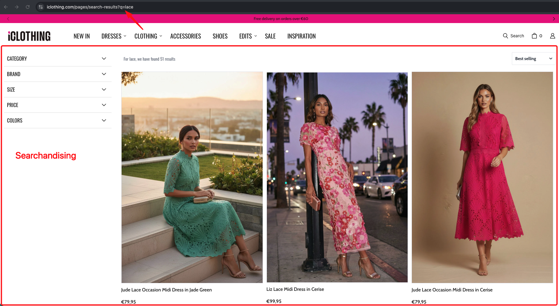
What the Visitor Sees on Desktop
Section titled “What the Visitor Sees on Desktop”On a wide screen, the results page typically has filters in a sidebar on the left, products in a grid on the right, sorting and result count at the top, selected filters as removable tags, and pagination at the bottom. Here is a real-world example:
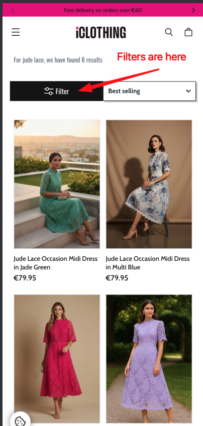
What the Visitor Sees on Mobile
Section titled “What the Visitor Sees on Mobile”On a narrow screen, the layout changes to fit. Filters are hidden behind a button, products are stacked in a narrower grid (usually 2 columns), and pagination might be replaced with a “Load more” button.
Here is a real-world example of a mobile search results page:
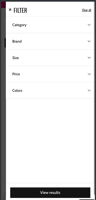
When the visitor taps the “Filters” button, a full-screen filter panel slides up:
What You Can Put on the Results Page
Section titled “What You Can Put on the Results Page”Here is the full list of building blocks you can include on the search results page:
| Building Block | What it does |
|---|---|
| Product list | The grid of product cards showing search results. |
| Filters | Panels that let visitors narrow results by category, brand, price, size, color, etc. |
| Selected filters | Tags showing the currently active filters, with an “x” button to remove each one. |
| Sorting | A dropdown, button bar, or modal that lets visitors change the result order. |
| Visual sorting | Buttons that let visitors switch between grid sizes (e.g., 2 columns, 3 columns, 4 columns). |
| Result count | Text showing how many results were found (e.g., “85 results for shoes”). |
| Banners | Promotional images placed above or below the results. |
| Suggestions | Alternative search terms the visitor might want to try. |
| Search input | A search bar on the results page so visitors can search again. |
| Search button | A button to submit a new search. |
| Logo | The Segmentify or customer logo. |
| Go back button | A button to go back to the previous state. |
| Custom content | Any custom content blocks you want to inject. |
How the Page Is Arranged
Section titled “How the Page Is Arranged”The results page uses a grid system to arrange building blocks. Think of it like a spreadsheet with 12 columns.
Each building block takes up a certain number of columns:
- Filters might take up 3 columns (one-quarter of the page).
- Products might take up 9 columns (three-quarters of the page).
- A banner might take up all 12 columns (full width).
Building blocks can also be stacked vertically inside a group. For example, the sorting dropdown and the result count can be placed side by side in a horizontal row above the product grid.
For more details on how the layout works, see Layout System.
The Search Query
Section titled “The Search Query”When the visitor searches for something, the SDK manages the search query. Here is what you can control:
| Property | Description |
|---|---|
| name | The name used in the URL. For example, if you set it to q, the URL becomes /search?q=shoes. |
| update.history | Whether the search query is reflected in the browser’s address bar. This lets visitors share search links. |
| update.url | Whether pressing the back button takes the visitor to their previous search. |
| update.title | You can customize the browser tab title when a search is active (e.g., “Results for shoes”). |
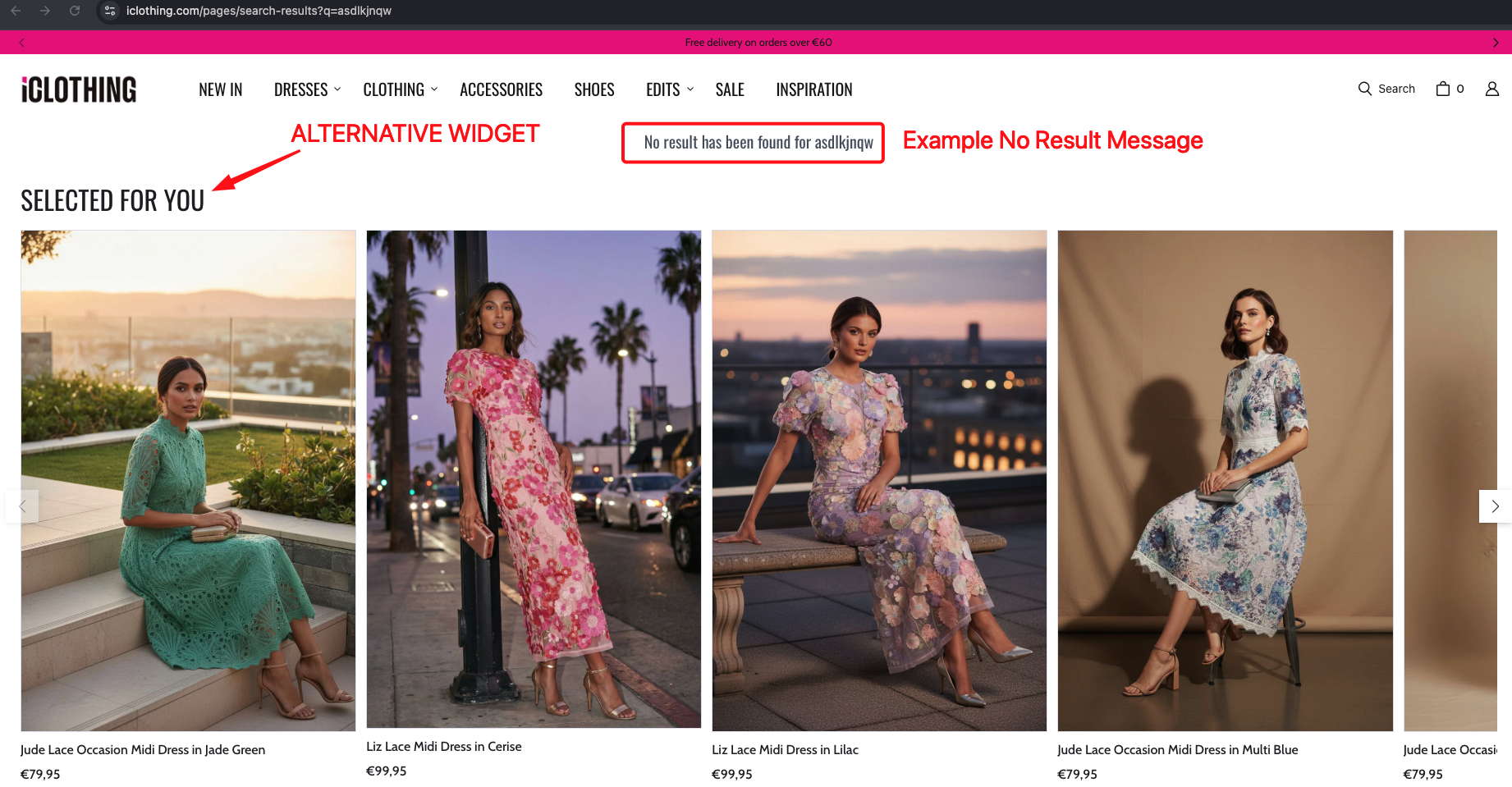
No Results
Section titled “No Results”When a search returns no products, the SDK shows a “no results” message. For example:
“No results found for ‘asdfgh’. However, don’t give up! You can try searching with different keywords.”
You can customize this message through the language settings (see Languages and Translations).
When there are no results, the SDK can also show alternative product recommendations to keep the visitor engaged.
Real-world example:
Summary
Section titled “Summary”| Capability | What it means |
|---|---|
| Product grid | A grid of product cards showing search results. |
| Filters (sidebar or modal) | Visitors can narrow results by category, brand, price, color, size, rating, and more. |
| Sorting | Visitors can reorder results by price, popularity, name, or relevance. |
| Pagination | Visitors can browse through pages of results, or load more with a button. |
| Grid size toggle | Visitors can switch between different grid column counts. |
| Result count | Shows how many products matched the search. |
| Banners | Promotional images above or below results. |
| Suggestions | Alternative search terms related to the query. |
| No results page | A friendly message with recommendations when nothing is found. |
| URL sync | The search query appears in the URL so visitors can share or bookmark it. |
| Mobile vs Desktop | Completely different layouts for phones and computers. |
Configuration Reference (for developers)
Section titled “Configuration Reference (for developers)”The Searchandising system is configured through the searchandising key in the main config object passed to SegmentifySearch.run(). It has separate mobile and desktop sub-keys for layout, plus top-level settings:
SegmentifySearch.run({ searchandising: { pathName: '/search', service: 'default', desktop: { layout: { /* ... */ }, query: { /* ... */ }, }, mobile: { layout: { /* ... */ }, query: { /* ... */ }, }, }, // ... other config keys});Top-level settings
Section titled “Top-level settings”searchandising: { pathName: '/search', // Required. URL path where the results page renders service: 'default', // Backend service identifier desktop: { /* layout and query */ }, mobile: { /* layout and query */ },}layout — the page structure
Section titled “layout — the page structure”Each device (desktop / mobile) has a layout object that defines the full page structure as a tree of building blocks.
layout: { component: 'main', // Required. Always 'main' at the top level viewMode: 'vertical', // Required. 'horizontal' or 'vertical' target: '#root', // Required. CSS selector for the DOM element to render into children: [ /* ... */ ], // Building blocks that make up the page}The building blocks you can place inside the layout:
| Component | What it does | Key options (componentOptions) |
|---|---|---|
facet | Filter panel for narrowing results. | type — 'sidebar', 'topList', 'modal', or 'dropdown'. searchLimit (number). facets — array of facet definitions. applyButton — apply button settings. facetHeader — header settings. isSticky (boolean). |
selectedFacet | Tags showing currently active filters with remove buttons. | withoutApplyButton (boolean). replacerFunction (function) — custom display name for filter values. |
sorting | Controls for reordering results. | isDropdown (boolean). isModal (boolean). isApplyButtonEnabled (boolean). buttonLimit (number or null). orderTypes — array of sort options. |
visualSorting | Buttons to switch between grid column counts. | visualOrders — array of column counts (e.g. [4, 3, 2]). defaultOrder — the default column count. |
stat | Displays the result count (e.g. “85 results for shoes”). | No required options. |
productList | The main product results grid. | pagination.type — 'default' or 'infinite'. pagination.scrollTop (boolean). pagination.isSeeAll (boolean). pagination.isLoadMore (boolean). loading and noResult — design settings. customActions — custom product actions. |
banners | Promotional images at configurable positions. | position — 'RESULTS_HEADER' or 'RESULTS_FOOTER'. |
suggestions | Alternative search terms related to the query. | minProductCount (number). header.title (string). |
searchInput | A search bar on the results page. | placeholder (string). clearIcon (boolean). |
searchButton | A button to submit a new search. | trigger — 'redirect' or 'openSearch'. innerText (string). |
logo | Displays a logo image. | logoSrc (string) — URL of the logo. |
goBackButton | A button to return to the previous state. | No required options. |
separator | A generic container for nesting other components. | Accepts children, viewMode, justifyContent, gap, styleId. |
query — search query behavior
Section titled “query — search query behavior”Each device also has a query object that controls how the search query is managed.
query: { name: 'q', // Required. URL parameter name (e.g. /search?q=shoes) callbacks: { before(query) { /* ... */ }, // Called before making a search request after(query, result) { /* ... */ }, // Called after the response arrives }, update: { history: true, // Create browser history entries (back button works) url: true, // Reflect search query in the address bar title(query) { // Custom page title return `Results for ${query.query}`; }, delay: 300, // Milliseconds to wait before updating URL/history/title },}facets — filter definitions
Section titled “facets — filter definitions”The facets array inside the facet component defines which filters to show and how they behave:
facets: [ { property: 'category', type: 'treeView' }, { property: 'brand', type: 'pickList', // 'treeView', 'pickList', 'sliding', 'colorPick', 'inputBoxes', 'switchButton', 'starPickList' designName: 'default', sort: { type: 'name', direction: 'ASC' }, // Only for 'treeView' and 'pickList' }, { property: 'price', type: 'sliding', hasCurrency: true, // Show currency symbol (required for price) withInputBoxes: true, // Show min/max input boxes alongside slider }, { property: 'colors', type: 'colorPick', colorList: [ // Map color names to CSS values { name: 'Black', value: '#000000' }, { name: 'White', value: '#ffffff' }, ], }, { property: 'inStock', type: 'switchButton', checkValue: 'true', // Value that activates the switch }, { property: 'rating', type: 'starPickList', fullHTML: '<span>★</span>', // Custom HTML for a filled star emptyHTML: '<span>☆</span>', // Custom HTML for an empty star },];Shared layout properties
Section titled “Shared layout properties”Every component in the layout tree also accepts these shared properties:
{ component: 'productList', // Required. The component type width: 12, // 1-12 column grid designName: 'default', // Visual design variant viewMode: 'horizontal', // 'horizontal' or 'vertical' justifyContent: 'between', // 'start', 'end', 'center', 'between', 'around', 'evenly', 'stretch' gap: 2, // 0-10 spacing (each unit = 0.25rem) styleId: 'my-custom-id', // Custom CSS id for targeting children: [ /* ... */ ], // Nested components (separator is the generic container)}Full example
Section titled “Full example”SegmentifySearch.run({ searchandising: { pathName: '/search', service: 'default', desktop: { layout: { component: 'main', viewMode: 'vertical', target: '#root', children: [ { component: 'facet', width: 3, type: 'topList', componentOptions: { searchLimit: 20, facets: [ { property: 'category', type: 'treeView' }, { property: 'brand', type: 'pickList', sort: { type: 'name', direction: 'ASC' }, }, { property: 'price', type: 'sliding', hasCurrency: true, withInputBoxes: true, }, { property: 'colors', type: 'colorPick', colorList: [ { name: 'Black', value: '#000000' }, { name: 'White', value: '#ffffff' }, ], }, ], applyButton: { enabled: false, text: 'apply', position: 'end' }, facetHeader: { enabled: true, defaultOpen: true }, isSticky: true, }, }, { component: 'separator', viewMode: 'vertical', width: 12, children: [ { component: 'separator', viewMode: 'horizontal', width: 12, justifyContent: 'between', children: [ { component: 'stat', width: 5 }, { component: 'separator', viewMode: 'horizontal', width: 7, justifyContent: 'end', gap: 2, children: [ { component: 'sorting', width: 6, componentOptions: { isDropdown: true, orderTypes: [ 'BEST_MATCH', 'PRICE_ASC', 'PRICE_DESC', 'BEST_SELLERS', 'NEWEST', ], }, }, { component: 'visualSorting', width: 6, componentOptions: { visualOrders: [4, 3, 2], defaultOrder: 4, }, }, ], }, ], }, { component: 'selectedFacet', width: 12 }, { component: 'productList', width: 12, componentOptions: { pagination: { type: 'default', scrollTop: true }, loading: { designName: 'default', skeletonCount: 20 }, noResult: { designName: 'default' }, }, }, ], }, ], }, query: { name: 'q', update: { history: true, url: true, title(query) { return `Search Results for ${query.query}`; }, }, }, }, mobile: { layout: { component: 'main', viewMode: 'vertical', target: '#root', children: [ { component: 'separator', viewMode: 'horizontal', width: 12, justifyContent: 'between', gap: 4, children: [ { component: 'facet', width: 3, type: 'modal', componentOptions: { searchLimit: 20, facets: [ { property: 'category', type: 'treeView' }, { property: 'brand', type: 'pickList' }, { property: 'price', type: 'sliding', hasCurrency: true, withInputBoxes: true, }, ], applyButton: { enabled: true, text: 'apply', position: 'end', }, facetHeader: { enabled: true }, isSticky: true, }, }, { component: 'sorting', width: 3, componentOptions: { isDropdown: false, isModal: true, orderTypes: [ 'BEST_MATCH', 'PRICE_ASC', 'PRICE_DESC', 'BEST_SELLERS', 'NEWEST', ], }, }, ], }, { component: 'selectedFacet', width: 12 }, { component: 'stat', width: 12 }, { component: 'productList', width: 12, componentOptions: { pagination: { type: 'infinite', isSeeAll: true, isLoadMore: true, }, }, }, ], }, query: { name: 'q', update: { history: true, url: true, title(query) { return `Search Results for ${query.query}`; }, }, }, }, }, // ...searchInput, searchBox, breakpoint, etc.});