Building Blocks (Components)
Every building block available in the SDK and what each one does.
This page lists every building block available in the SDK and explains what each one does.
What Are Building Blocks?
Section titled “What Are Building Blocks?”Building blocks are the individual pieces that make up the search experience. Each building block does one specific thing. For example, showing products, displaying filters, rendering a search button, etc.
You mix and match these building blocks to create the search experience you want. Every system (Search Input, Searchbox, and Searchandising) uses the same set of building blocks.
The SDK comes with 19 building blocks. Below is a description of each one.
Product Display
Section titled “Product Display”Product List
Section titled “Product List”What the visitor sees: A grid of product cards on the search results page.
Each product card typically shows the product image, name, price, and sometimes additional details like ratings or “out of stock” labels.
What you can control:
- How many skeleton loading placeholders to show while results are loading.
- What to show when no results are found.
- Whether to use numbered pages, a “Load More” button, or a “See All” link for pagination.
- Whether the page scrolls to the top when the visitor changes pages.
- You can provide a custom product card design if the default one doesn’t fit.
Product List (Searchbox version)
Section titled “Product List (Searchbox version)”What the visitor sees: A smaller product grid inside the Searchbox popup.
This works the same as the regular product list, but it is designed for the popup. It usually shows fewer products and has a simpler layout.
What you can control:
- Loading skeleton appearance and count.
- A header above the product list (can include a “See All” link).
- Custom product card design.
- What to show when no results are found.
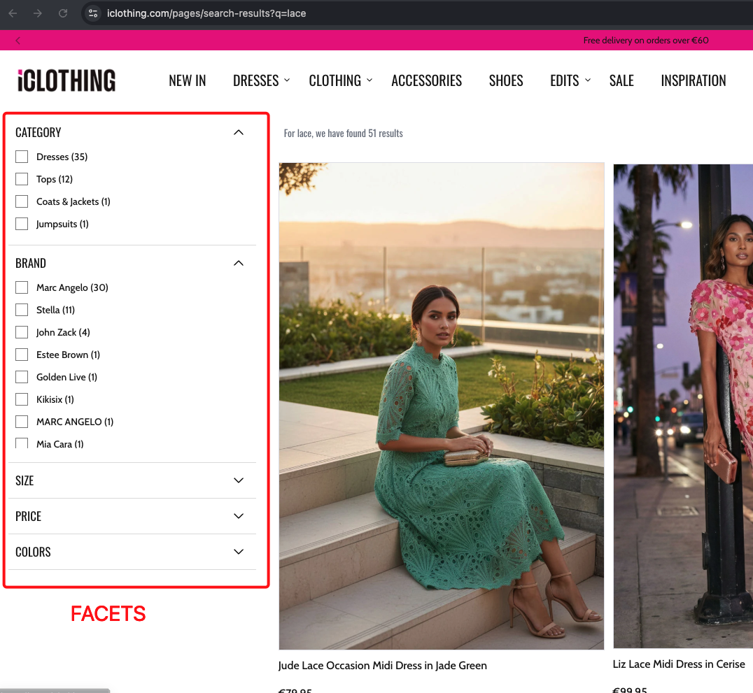
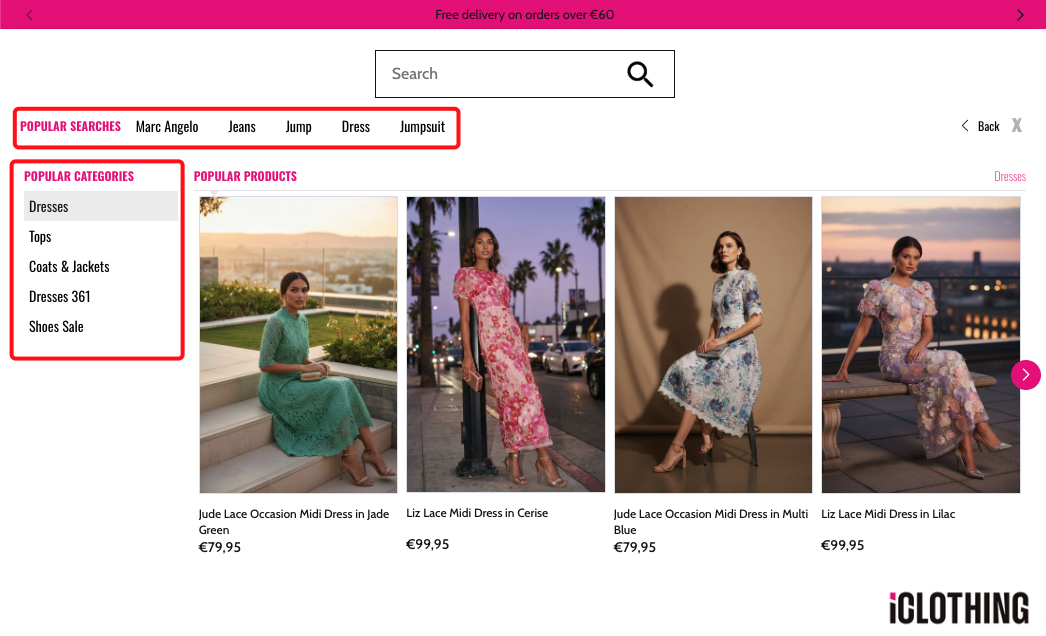
Filters
Section titled “Filters”Filters (Facets)
Section titled “Filters (Facets)”What the visitor sees: A panel of filter options that lets them narrow down search results.
Filters can appear in four different styles:
- Sidebar — A vertical panel on the side of the page (common on desktop).
- Top list — A horizontal bar of filters above the results.
- Modal — A full-screen popup showing all filters (common on mobile).
- Dropdown — A compact dropdown that expands when clicked.
For a deep dive into all filter types (category tree, checkboxes, sliders, color swatches, etc.), see Filters (Facets).
Real-world example:
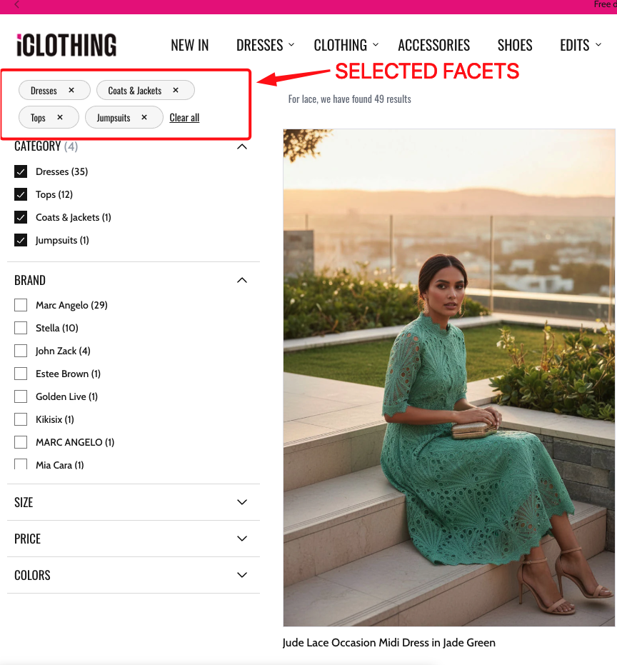
Selected Filters
Section titled “Selected Filters”What the visitor sees: Small tags or pills showing which filters are currently active. Each tag has an “x” button to remove that filter.
For example: Brand: Nike x | Color: Black x | Clear all
Real-world example:
What you can control:
- How the tags are displayed (scrollable list or wrapped).
- Whether filters are applied immediately when removed, or only after clicking an “Apply” button.
- Custom icon for the remove button.
Real-world example:
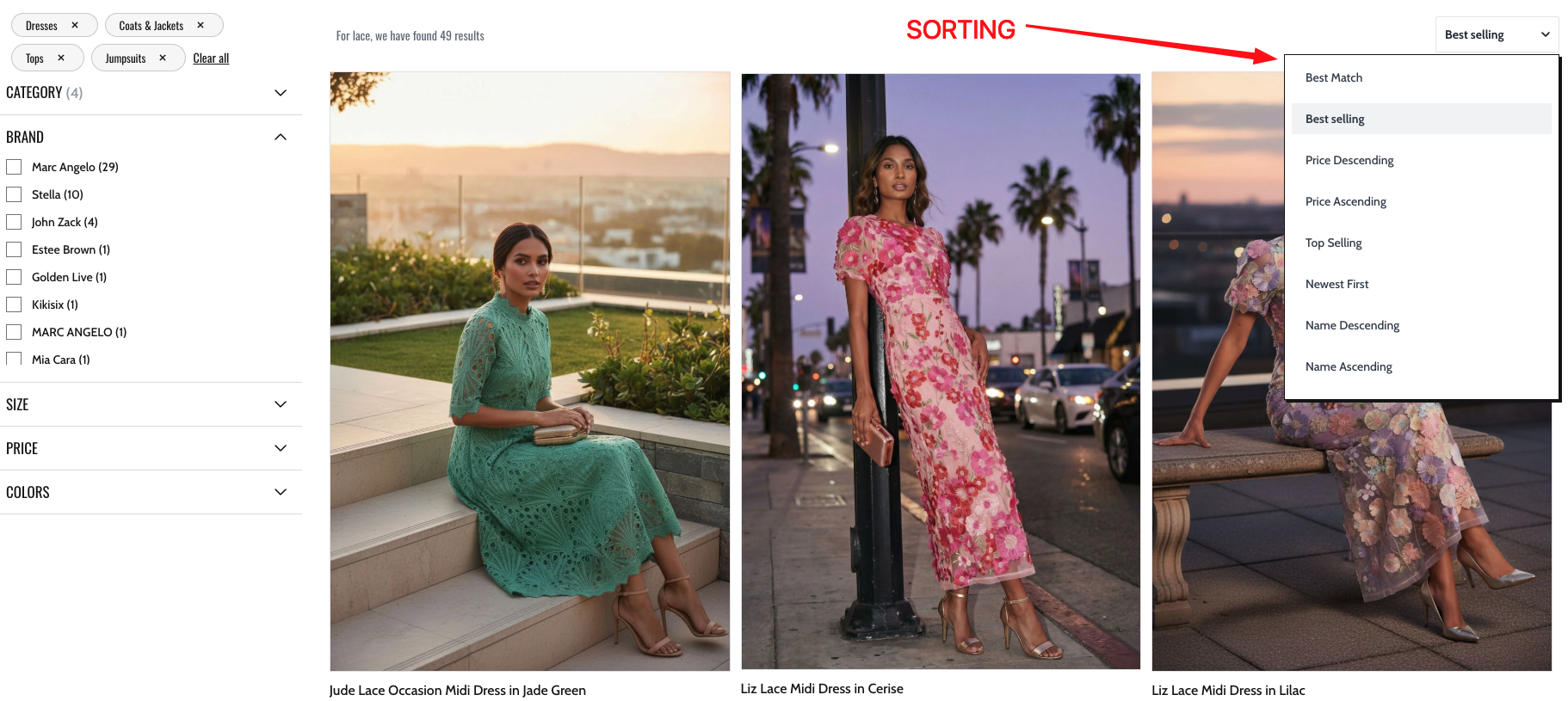
Sorting and View Options
Section titled “Sorting and View Options”Sorting
Section titled “Sorting”What the visitor sees: A way to change the order of search results.
Available sort orders include: Smart Sorting, Best Match, Price (high to low), Price (low to high), Best Sellers, Newest First, Name (A-Z), and Name (Z-A).
Sorting can be displayed as:
- A dropdown menu.
- A row of buttons.
- A list dropdown (a dropdown that shows options as a list).
- A modal popup (mainly on mobile).
For more details, see Sorting and Pagination.
Real-world example:
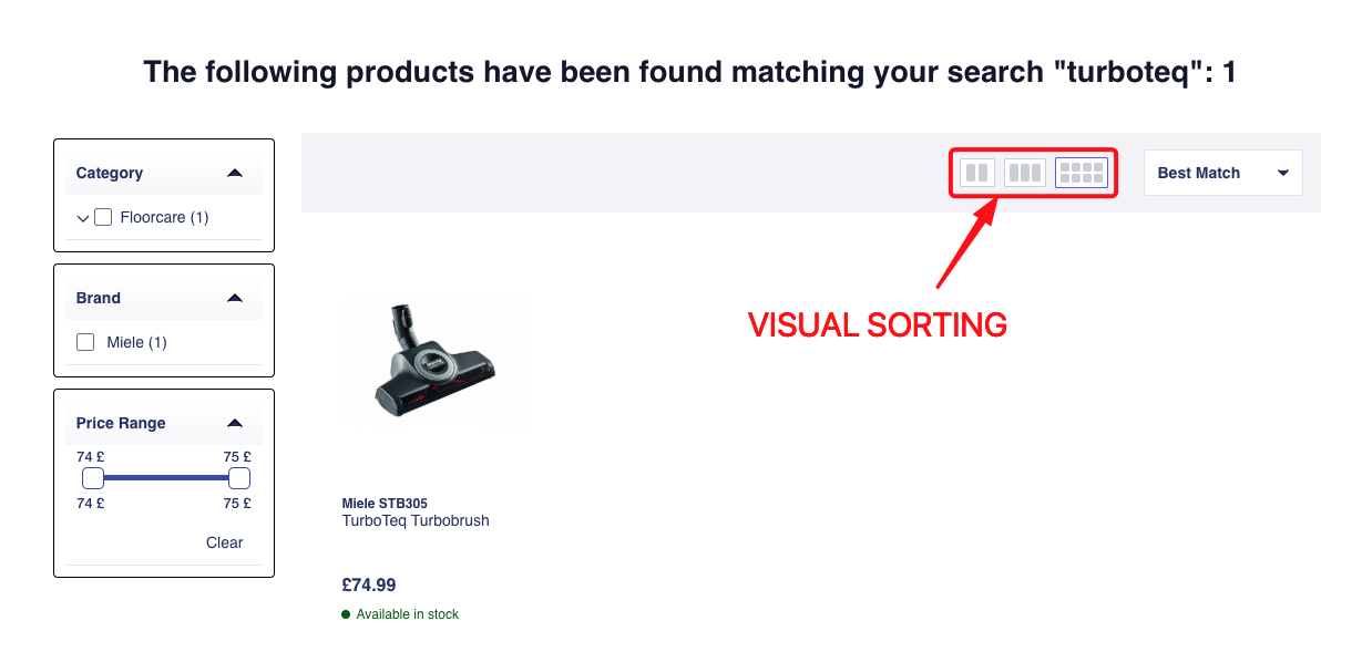
Visual Sorting (Grid Toggle)
Section titled “Visual Sorting (Grid Toggle)”What the visitor sees: Small buttons (usually icons) that let them switch between different grid sizes. For example, toggling between showing 2, 3, or 4 products per row.
What you can control:
- Which grid sizes are available (e.g., 2 columns, 3 columns, 4 columns).
- Which grid size is selected by default.
Real-world example:
Search Input Elements
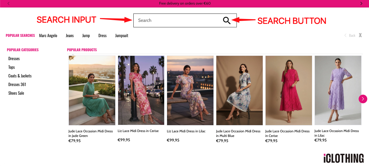
Section titled “Search Input Elements”Search Input
Section titled “Search Input”What the visitor sees: A text field where they type their search query.
What you can control:
- Placeholder text (the grey text shown before the visitor types, e.g., “Search products…”).
- Whether to show a “clear” icon that lets the visitor erase what they typed.
Search Button
Section titled “Search Button”What the visitor sees: A clickable button next to the search input (often a magnifying glass icon or the word “Search”).
What you can control:
- The button text or icon.
- What happens when clicked: either go to the full results page, or trigger the search within the popup.
Real-world example:
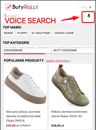
Voice Search
Section titled “Voice Search”What the visitor sees: A microphone icon button next to the search input. Clicking it lets the visitor speak their search query instead of typing.
Real-world example:
Barcode Scanner
Section titled “Barcode Scanner”What the visitor sees: A barcode scanner icon button next to the search input. Clicking it lets the visitor scan a barcode instead of typing.
What you can control:
- The barcode format(s) to scan.
- The barcode scanner icon.
- What happens after detection: only fill input, or fill and trigger search.
- Camera facing mode (
environmentoruser).
component: 'barcodeScanner',width: 2,componentOptions: { format: 'unknown', // single preferred format // formats: ['ean_13', 'qr_code'], // optional list (takes priority over format) onDetect: 'fillOnly', // 'fillOnly' | 'fillAndTrigger' trigger: 'redirect', // used when onDetect is 'fillAndTrigger' cameraFacingMode: 'environment', // 'environment' | 'user' customIcon: '', // optional icon URL iconSvg: '', // optional raw SVG string}Real-world example:

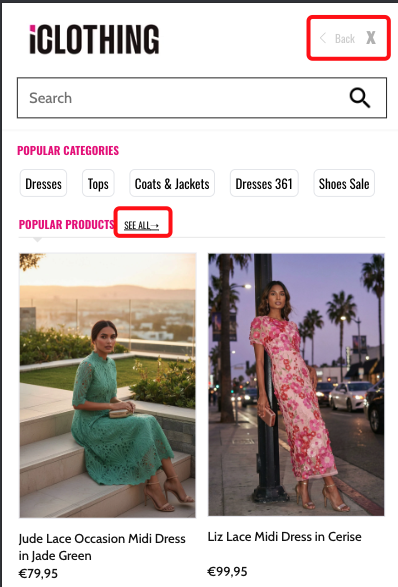
Close Button
Section titled “Close Button”What the visitor sees: An “X” button that closes the Searchbox popup.
What you can control:
- Whether clicking the close button also clears the search input text.
Go Back Button
Section titled “Go Back Button”What the visitor sees: A back arrow or “Go Back” button that returns to the previous state.
See All Button
Section titled “See All Button”What the visitor sees: A link or button labeled “See All” that takes them from the Searchbox popup to the full search results page.
Real-world example:
Content and Promotions
Section titled “Content and Promotions”Banners
Section titled “Banners”What the visitor sees: Promotional images or messages placed above or below the search results (or inside the Searchbox popup).
Banners are placed at specific positions:
- Above the results (header position).
- Below the results (footer position).
You configure the banners through the Segmentify dashboard. The SDK simply displays them at the positions you choose.
Asset List
Section titled “Asset List”What the visitor sees: A list of clickable items like top categories, popular brands, trending keywords, or recent searches. These usually appear in the Searchbox popup before the visitor types.
Asset lists can show:
| Asset Type | Description |
|---|---|
| Categories | Top product categories (e.g., “Electronics”, “Shoes”). |
| Brands | Top brands (e.g., “Nike”, “Apple”). |
| Keywords | Popular search terms (e.g., “summer sale”, “gift ideas”). |
| Recent searches | The visitor’s own past search queries. |
Real-world example:
What you can control:
- Which type of asset to display.
- Whether to show them in a horizontal slider (swipeable) or a plain list.
- Whether clicking or hovering triggers an action (like showing products).
- A header above the list (e.g., “Popular Categories”).
- Redirecting specific items to custom URLs.
Brand Logo List
Section titled “Brand Logo List”What the visitor sees: A visual list of brand logos. Clicking a logo filters or searches for that brand.
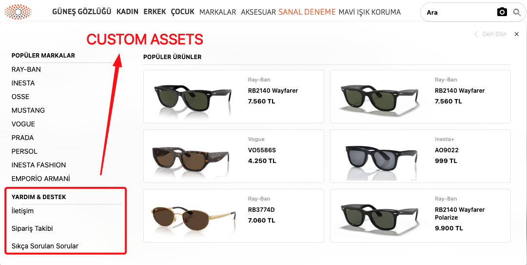
Custom Assets
Section titled “Custom Assets”What the visitor sees: Custom content blocks that you define. These can be anything you want to show in the search experience.
What you can control:
- The content of each custom asset.
- A header above the custom assets section.
Real-world example:
Page Structure Elements
Section titled “Page Structure Elements”Result Count (Stat)
Section titled “Result Count (Stat)”What the visitor sees: A line of text showing how many results were found. For example: “For shoes, we found 85 results.”
What the visitor sees: A logo image, typically the Segmentify logo or the customer’s own logo.
What you can control:
- The logo image.
- A link URL (clicking the logo goes to a specific page).
Full Building Block List
Section titled “Full Building Block List”| Building Block | What it does | Used in |
|---|---|---|
| Product List | Shows the product grid on the results page. | Searchandising |
| Product List (Searchbox) | Shows a smaller product grid in the popup. | Searchbox |
| Filters | Lets visitors narrow results by category, brand, price, etc. | Searchandising |
| Selected Filters | Shows active filters as removable tags. | Searchandising |
| Sorting | Lets visitors reorder results. | Searchandising |
| Visual Sorting | Lets visitors switch grid column count. | Searchandising |
| Result Count | Shows “X results for Y”. | Searchandising |
| Banners | Promotional images above/below results. | Searchandising, Searchbox |
| Asset List | Categories, brands, keywords, or recent searches. | Searchbox |
| Search Input | The text field for typing queries. | Search Input, Searchbox |
| Search Button | The submit button next to the input. | Search Input, Searchbox |
| Go Back Button | Returns to the previous state. | Searchbox |
| Logo | Displays a logo image. | Searchbox, Searchandising |
| Close Button | Closes the popup. | Searchbox |
| Voice Search | Microphone button for voice input. | Search Input, Searchbox |
| See All Button | Link to the full results page. | Searchbox |
| Custom Assets | Custom content blocks. | Searchbox, Searchandising |
| Brand Logo List | Visual list of brand logos. | Searchbox |
Configuration Reference (for developers)
Section titled “Configuration Reference (for developers)”Every building block is a component registered in the SDK’s render pipeline. When you place a building block in a layout tree, you specify its component name and optionally pass componentOptions to override defaults. The SDK merges your options with built-in defaults via the LayoutProvider.
Each building block also uses the designName property to select its visual theme. See Design System for details.
Component name mapping
Section titled “Component name mapping”These are the exact component strings you use in a layout tree:
| Component string | Building block |
|---|---|
productList | Product List |
productListSearchbox | Product List (Searchbox) |
facet | Filters |
selectedFacet | Selected Filters |
sorting | Sorting |
visualSorting | Visual Sorting |
stat | Result Count |
banners | Banners |
assetList | Asset List |
brandLogoList | Brand Logo List |
suggestions | Suggestions |
customAssets | Custom Assets |
searchInput | Search Input |
searchButton | Search Button |
voiceSearch | Voice Search |
barcodeScanner | Barcode Scanner |
closeButton | Close Button |
goBackButton | Go Back Button |
seeAllButton | See All Button |
logo | Logo |
header | Search Page Header |
modal | Search Modal |
separator | Layout container |
main | Root layout container |
Shared layout defaults
Section titled “Shared layout defaults”Every component placed in a layout tree receives these defaults unless overridden:
{ width: 12, // Column span on a 12-column grid designName: 'default', // Visual design variant viewMode: 'vertical', // 'horizontal' or 'vertical' alignItems: '', // CSS align-items value justifyContent: '', // CSS justify-content value gap: 0, // Spacing between children (each unit = 0.25rem)}productList options
Section titled “productList options”componentOptions: { pagination: { type: 'default', // 'default' (numbered pages) or 'infinite' (continuous scroll) disabled: false, // Disable pagination entirely isLoadMore: false, // Show "Load more" button (only for 'infinite') isSeeAll: false, // Show "See all" link (only for 'infinite') scrollTop: true, // Scroll to top on page change (only for 'default') }, loading: { designName: 'default', // Design variant for the loading skeleton skeletonCount: 10, // Number of skeleton placeholders }, noResult: { designName: 'default', // Design variant for the "no results" message }, scrollControl: false, // Enable scroll position control customActions: {}, // Custom callbacks: quickView, addToCart, addToWishlist customProductTemplate: null, // Custom product card renderer function afterRender: null, // Callback fired after render, receives products array}productListSearchbox options
Section titled “productListSearchbox options”componentOptions: { loading: { designName: 'default', // Design variant for the loading skeleton skeletonCount: 10, // Number of skeleton placeholders }, noResult: { designName: 'default', // Design variant for the "no results" message }, headerConfig: { designName: 'default', // Design variant for the header above the product list seeAll: false, // Show a "See All" link in the header }, customActions: {}, // Custom action callbacks customProductTemplate: null, // Custom product card renderer function}facet options
Section titled “facet options”componentOptions: { type: 'sidebar', // 'sidebar', 'topList', 'modal', or 'dropdown' facets: [], // Array of facet definitions (see Filters doc) applyButton: { enabled: true, // Show an "Apply" button text: 'apply', // Button label (translated via dictionary) position: 'end', // 'start' or 'end' }, facetHeader: { enabled: true, // Show a header for each facet group defaultOpen: false, // Expand facet groups by default customIcon: false, // Custom expand/collapse icons }, seeMoreButton: { enabled: false, // Show "See more" when there are many options limit: 5, // Options visible before "See more" appears }, searchLimit: 20, // Min options before a search input appears inside facet hideLimit: false, // Limit for hiding facets optionHeader: false, // Show a title for each facet option isSticky: true, // Make panel sticky on scroll (only for 'sidebar')}selectedFacet options
Section titled “selectedFacet options”componentOptions: { withoutApplyButton: true, // Hide "Apply" button (apply immediately on remove) viewType: 'scroll', // 'scroll' (horizontal) or 'wrap' (wraps to next line) customIcon: null, // Custom HTML/SVG for the remove button replacerFunction: (property, text) => text,// Custom function to transform filter display name}sorting options
Section titled “sorting options”componentOptions: { orderTypes: [ // Available sort options 'SMART_SORTING', 'BEST_MATCH', 'PRICE_DESC', 'PRICE_ASC', 'BEST_SELLERS', 'NEWEST', 'ALPHABETICAL_DESC', 'ALPHABETICAL_ASC', ], isDropdown: true, // Show as a dropdown isModal: false, // Show in a modal (common on mobile) isListDropdown: false, // Show as a list-style dropdown isApplyButtonEnabled: false, // Show "Apply" button inside sorting panel buttonLimit: null, // Max sort buttons to show (null = no limit) listLimit: 3, // Max items before scrolling in list dropdown mode customIcon: false, // Custom dropdown icon}visualSorting options
Section titled “visualSorting options”componentOptions: { visualOrders: [4, 3, 2], // Available grid column counts to toggle between defaultOrder: null, // Default column count (must be in visualOrders)}assetList options
Section titled “assetList options”componentOptions: { assetType: 'categories', // 'categories', 'brands', 'keywords', or 'lastSearches' hasSlider: false, // Display items in a horizontal slider action: null, // 'hover' or 'click' header: {}, // Header config (e.g. { viewMode: 'horizontal' }) redirectionMap: {}, // Map specific items to custom URLs accordion: null, // Accordion settings (e.g. { sliceFirst: 10, sliceLast: 1 }) highlight: false, // Highlight matching text in items categoryTreeView: false, // Show categories in a tree structure logoList: {}, // Map brand names to logo URLs clearQueryBasedEnabled: true, // Clear query-based assets when query changes sliderConfig: {}, // Custom slider config (breakpoints, slides per view, etc.)}suggestions options
Section titled “suggestions options”componentOptions: { maxSuggestions: 5, // Maximum number of suggestions to display minProductCount: 10, // Minimum product count for a suggestion to show blackList: [], // Words to never suggest (case-insensitive) header: {}, // Header config (e.g. { title: 'Suggestions' }) triggerModul: 'searchandising',// Which system the suggestion navigates to customFn: null, // Custom function to transform or filter suggestions}banners options
Section titled “banners options”componentOptions: { position: null, // 'RESULTS_HEADER', 'RESULTS_FOOTER', 'ASSETS_HEADER', or 'ASSETS_FOOTER' bannerDetails: [], // Banner data (managed through the Segmentify dashboard)}searchButton options
Section titled “searchButton options”componentOptions: { trigger: 'redirect', // 'redirect' (go to results page) or 'openSearch' (open popup) className: '', // Additional CSS class name onClick: null, // Custom click handler isSecondInput: false, // Whether this belongs to a second search bar}searchInput options
Section titled “searchInput options”componentOptions: { placeholder: 'Search products...', // Placeholder text in the input clearIcon: true, // Show a clear button className: '', // Additional CSS class name isSecondInput: false, // Whether this belongs to a second search bar}closeButton options
Section titled “closeButton options”componentOptions: { inputClearText: false, // When true, closing the popup also clears the input text}logo options
Section titled “logo options”componentOptions: { logoSrc: 'https://...', // URL of the logo image (defaults to Segmentify logo) href: null, // Link URL when the logo is clicked}customAssets options
Section titled “customAssets options”componentOptions: { assets: [], // Array of custom content items header: {}, // Header configuration for the custom section}