Filters (Facets)
All the ways visitors can narrow down search results using filters.
This page explains all the ways visitors can narrow down search results using filters.
What Are Filters?
Section titled “What Are Filters?”Filters (also called facets) let visitors narrow down search results by specific criteria. Instead of scrolling through hundreds of products, the visitor picks what they care about and only sees matching products.
For example, a visitor searching for “shoes” might filter by:
- Category: Running shoes
- Brand: Nike
- Price: $50 - $150
- Color: Black
- Size: 42
The SDK supports seven different types of filters, each designed for a different kind of data.
Custom filter properties: Standard properties like
category,brand,price,colors, andsizeswork out of the box. If you need a custom property (e.g.,params.rating,params.freeShipping), you must first open a Jira task with the backend team to activate it. Once the backend enables it, you can register it in yoursearch.config.js.
Filter Types
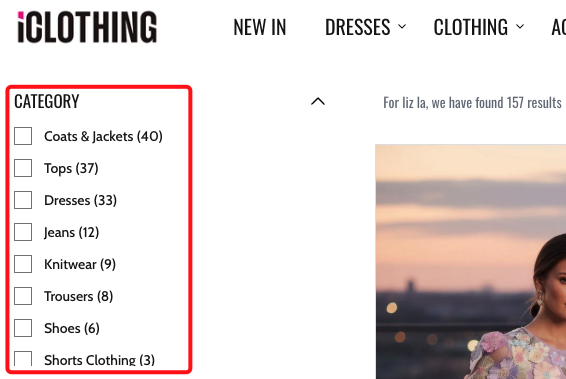
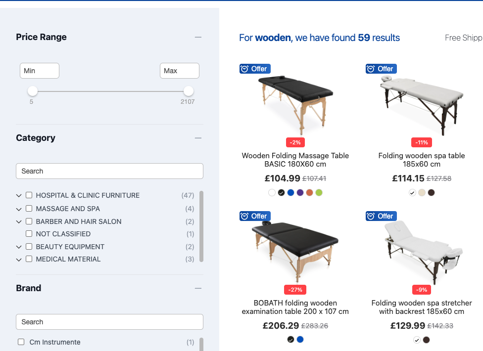
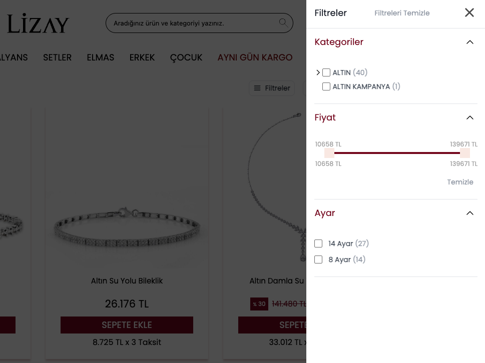
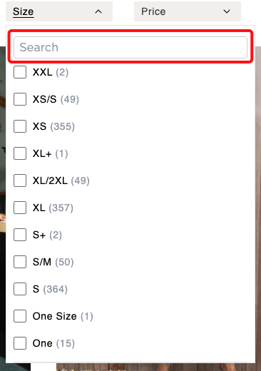
Section titled “Filter Types”1. Checkbox List (pickList)
Section titled “1. Checkbox List (pickList)”What the visitor sees: A list of options with checkboxes. The visitor can select one or more options.
Best for: Brand, size, gender, material, or any property with a fixed set of values.
Brand[x] Nike (45)[ ] Adidas (32)[ ] Puma (18)[ ] New Balance (12)The number in parentheses shows how many products match each option.
You can also sort the options by name (alphabetical) or by count (most products first).
Real-world example:
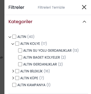
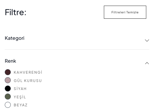
2. Category Tree (treeView)
Section titled “2. Category Tree (treeView)”What the visitor sees: A hierarchical list of categories that can expand and collapse. Clicking a parent category shows its subcategories.
Best for: Category, department, or any property with a parent-child structure.
Categoryv Clothing > Shoes (85) > Jackets (42) > T-Shirts (67) Electronics > Headphones (23) > Speakers (15)Real-world example:
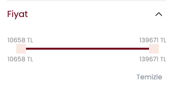
3. Range Slider (sliding)
Section titled “3. Range Slider (sliding)”What the visitor sees: A horizontal slider with two handles (minimum and maximum). The visitor drags the handles to set a range.
Best for: Price, weight, or any numeric value.
Price$0 |=====[###]=======| $500 $75 $200You can also show the currency symbol next to the values (e.g., $, EUR).
Real-world example:
4. Input Boxes (inputBoxes)
Section titled “4. Input Boxes (inputBoxes)”What the visitor sees: Two text fields labeled “Min” and “Max” where the visitor types a number range manually.
Best for: Price or any numeric value where the visitor wants to type an exact range rather than dragging a slider.
Price[ Min: 50 ] - [ Max: 200 ] [Apply]Real-world example:
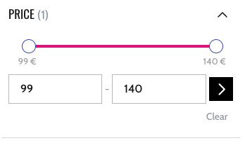
You can add an Apply button so the range only takes effect after the visitor confirms.
5. Color Swatches (colorPick)
Section titled “5. Color Swatches (colorPick)”What the visitor sees: Small colored circles or squares. The visitor clicks a color to filter products by that color.
Best for: Color, finish, or any property that can be represented as a color.
Colors (Black) (White) (Red) (Blue) (Green) (Gold) (Pink)Each swatch shows the actual color. You define the full list of colors and their visual values. Colors can even be gradients (e.g., “Wood Effect” shows a brown gradient).
Real-world example:
6. Star Rating (starPickList)
Section titled “6. Star Rating (starPickList)”What the visitor sees: Rows of star icons. The visitor clicks a row to filter products with that rating.
Best for: Customer ratings, quality scores, or any ranking system.
Rating[x] ★★★★★ (12)[ ] ★★★★☆ (34)[ ] ★★★☆☆ (56)[ ] ★★☆☆☆ (23)Real-world example:
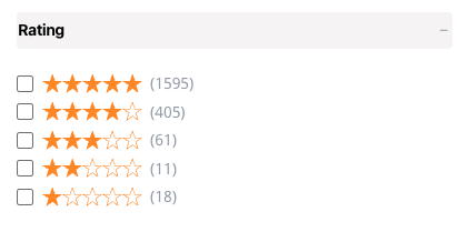
You can customize the star icons. For example, replace them with custom images.
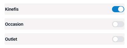
7. Toggle Switch (switchButton)
Section titled “7. Toggle Switch (switchButton)”What the visitor sees: An on/off toggle switch. Turning it on filters products by a specific condition.
Best for: Yes/no properties like “In stock”, “On sale”, “Free shipping”, “Organic”.
[ ON ●] Free shipping[● OFF] Organic onlyWhen the toggle is turned on, it filters for products where the property matches a specific value (e.g., “true”).
Real-world example:
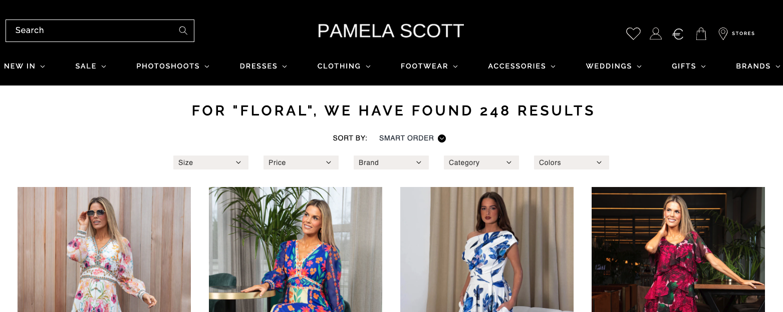
Filter Display Styles
Section titled “Filter Display Styles”The filter panel itself (the container that holds all the individual filters) can be displayed in four different styles:
Sidebar
Section titled “Sidebar”Filters appear in a vertical panel on the side of the page (usually the left side). This is the most common desktop layout. The sidebar can be sticky, meaning it stays visible as the visitor scrolls down the product list.
+============ Page (horizontal) =============+| || +- Sidebar -+ +------ Products --------+ || | | | | || | ▾ Brand | | +------+ +------+ | || | ☑ Nike | | | | | | | || | ☐ Adidas | | +------+ +------+ | || | | | +------+ +------+ | || | ▾ Price | | | | | | | || | [==●===] | | +------+ +------+ | || | | | | || | ▾ Color | | [ < 1 2 3 > ] | || | ● ● ● | | | || +------------+ +------------------------+ || |+============================================+Real-world example:
Top List
Section titled “Top List”Filters appear in a horizontal bar above the search results. Each filter group is shown inline.
+================ Page (vertical) ===================+| || [ Brand v ] [ Price v ] [ Color v ] [ Size v ] || || +----------+ +----------+ +----------+ || | Product | | Product | | Product | || +----------+ +----------+ +----------+ || +----------+ +----------+ +----------+ || | Product | | Product | | Product | || +----------+ +----------+ +----------+ || |+====================================================+Real-world example:
Filters appear in a full-screen popup. The visitor taps a “Filters” button, the popup opens, they make their selections, and close it. This is the most common mobile layout.
+-- Page --+ +===== Filter Modal =======+| | | [ X ] || [Filters]| ---> | ▾ Brand || | | ☑ Nike || +------+ | | ☐ Adidas || |Prod. | | | || +------+ | | ▾ Price || +------+ | | [==●===] || |Prod. | | | || +------+ | | ▾ Color || | | ● ● ● |+----------+ | | | [ Apply ] | +==========================+Real-world example:
Dropdown
Section titled “Dropdown”Filters appear in a compact dropdown that expands when clicked. This saves space on the page.
+================ Page =================+| || [ Brand v ] || +------------------+ || | ☑ Nike | || | ☐ Adidas | || | ☐ Puma | || +------------------+ || || +----------+ +----------+ || | Product | | Product | || +----------+ +----------+ || |+========================================+Real-world example:
Filter Options
Section titled “Filter Options”Beyond the filter type, there are several options that control how filters look and behave:
Filter Headers
Section titled “Filter Headers”Each filter group (e.g., “Brand”, “Price”) has a header at the top showing its name.
- Headers can be collapsible. The visitor clicks the header to expand or collapse the filter options below it.
- You can set whether filters start expanded or collapsed by default.
- You can use custom icons for the expand/collapse arrows.
See More Button
Section titled “See More Button”If a filter has many options (e.g., 50 brands), you can limit how many are shown at first. A “See More” button lets the visitor expand the full list.
For example, show the first 5 brands, then a “See More” link to reveal the rest.
Search Inside Filters
Section titled “Search Inside Filters”When a filter has many options, a search box appears inside the filter panel. The visitor can type to find a specific option instead of scrolling through the list.
You control the minimum number of options needed before the search box appears (e.g., only show the search box if there are more than 20 options).
Real-world example:
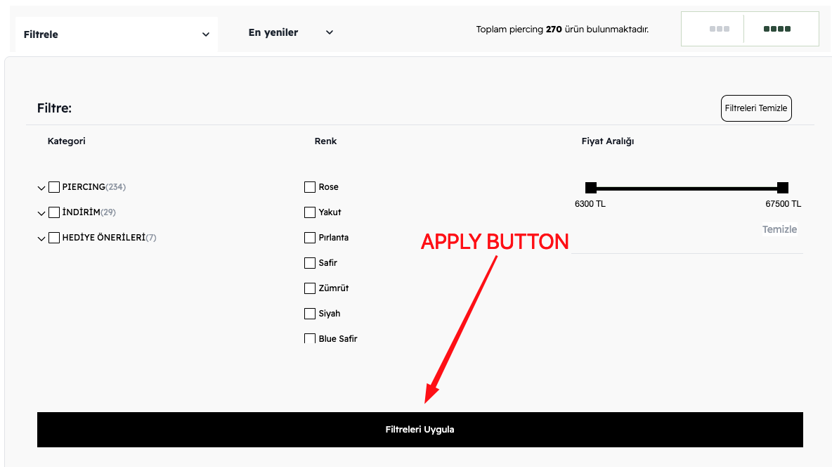
Apply Button
Section titled “Apply Button”You can choose between two behaviors:
- Instant apply — Every time the visitor checks or unchecks a filter, the results update immediately.
- Manual apply — The visitor makes all their selections first, then clicks an “Apply” button to update the results. This avoids multiple reloads.
The Apply button can appear at the top or bottom of the filter panel.
Real-world example:
Hide When Few Results
Section titled “Hide When Few Results”You can hide the entire filter panel when the number of products is below a certain threshold. If there are only 3 products, showing filters does not make much sense.
Summary
Section titled “Summary”Filter types
Section titled “Filter types”| Filter Type | What it looks like | Best for |
|---|---|---|
| Checkbox list | Checkboxes with labels and counts | Brand, size, material |
| Category tree | Expandable/collapsible hierarchy | Categories, departments |
| Range slider | Draggable min/max handles | Price, weight |
| Input boxes | Text fields for min and max values | Price (exact range) |
| Color swatches | Colored circles/squares | Color, finish |
| Star rating | Rows of star icons | Ratings, quality |
| Toggle switch | On/off toggle | In stock, free shipping |
Display styles
Section titled “Display styles”| Display Style | Description | Best for |
|---|---|---|
| Sidebar | Vertical panel on the side | Desktop |
| Top list | Horizontal bar above results | Desktop (compact) |
| Modal | Full-screen popup | Mobile |
| Dropdown | Compact expandable dropdown | Space-constrained layouts |
Filter options
Section titled “Filter options”| Option | What it controls |
|---|---|
| Collapsible headers | Whether filter groups can be expanded/collapsed by clicking the header. |
| See More button | Limits how many options are shown at first. |
| Search inside filters | Adds a search box when there are many filter options. |
| Apply button | Whether filters apply instantly or require a manual “Apply” click. |
| Sticky sidebar | Whether the filter panel stays visible while scrolling. |
| Hide when few results | Hides filters when there are very few products. |
| Custom icons | Use custom expand/collapse icons for filter headers. |
Configuration Reference (for developers)
Section titled “Configuration Reference (for developers)”Filters are configured through the facet building block in the layout tree. It selects the appropriate display style (Sidebar, TopList, Modal, or DropdownFacet). Each entry in the facets array maps to a visual sub-component from the design system (e.g., PickListInput, TreeViewInput, SlidingInput, ColorPick).
Facet component
Section titled “Facet component”{ component: 'facet', type: 'sidebar', // 'sidebar', 'topList', 'modal', or 'dropdown' componentOptions: { facets: [ /* see facet definitions below */ ], applyButton: { enabled: true, // Show an "Apply" button text: 'apply', // Button label (translated via dictionary) position: 'end', // 'start' or 'end' designName: 'default', }, facetHeader: { enabled: true, // Show collapsible headers per filter group defaultOpen: true, // Expand groups by default customIcon: false, // Custom expand/collapse icons designName: 'default', }, seeMoreButton: { enabled: false, // Show "See more" when many options limit: 5, // Options visible before "See more" appears }, searchLimit: 20, // Min options before a search box appears inside the filter hideLimit: false, // Hide filter panel when few results isSticky: true, // Sticky sidebar on scroll (only for 'sidebar') optionHeader: false, // Show a title for each facet option },}Facet definitions
Section titled “Facet definitions”facets: [ { property: 'brand', type: 'pickList', // Checkbox list designName: 'default', sort: { type: 'name', direction: 'ASC' }, // Sort by 'name' or 'count', 'ASC' or 'DESC' }, { property: 'category', type: 'treeView', // Expandable category hierarchy }, { property: 'price', type: 'sliding', // Range slider hasCurrency: true, // Show currency symbol withInputBoxes: true, // Show min/max input boxes alongside the slider }, { property: 'price', type: 'inputBoxes', // Manual min/max text fields hasCurrency: true, }, { property: 'colors', type: 'colorPick', // Color swatches colorList: [ { name: 'Black', value: '#000000' }, { name: 'White', value: '#ffffff' }, { name: 'Red', value: '#ff0000' }, ], }, { property: 'params.rating', type: 'starPickList', // Star rating rows fullHTML: '<span>★</span>', // Custom filled star HTML emptyHTML: '<span>☆</span>', // Custom empty star HTML }, { property: 'params.freeShipping', type: 'switchButton', // On/off toggle checkValue: 'true', // Value that activates the switch },];